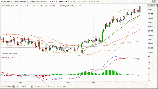
The arrow on the weekly chart below shows when it was first mentioned here, the breakout to the upside was just about to start. I think what the chart also shows is how once you get away from the noise of the shorter time frames on charts, the longer time frame periods look far smoother and like an ocean liner once under way any reverse takes a while to happen. The same tends to be true of these longer term trend moves. I would not want to bet against the company going higher from here until something changes on this longer time frame to justify it.
Chart:
 |
| Bown N - Weekly |
No comments:
Post a Comment